Minimal UI Icon Pack: Clean Design for Modern Web and App Interfaces
What Is the Minimal UI Icon Pack?
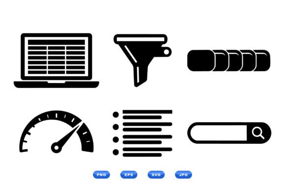
The Minimal UI Icon Pack is a streamlined collection of flat, monochrome icons designed for modern UI development. It includes essential dashboard elements like spreadsheet views, filter controls, pagination buttons, speed gauges, list views, and search bars—all crafted in a clean black-and-white style with sharp contours. The pack supports multiple file formats including SVG, EPS, PNG, and JPG, making it versatile for both digital and print use.
These icons are built with scalability in mind, ensuring crisp visuals at any size. Whether you're designing a mobile app, a web dashboard, or a printed report, this set offers a consistent visual language that enhances usability without overwhelming the interface.
Where Can Minimal UI Icons Make a Difference?
Designers and developers often struggle to find icon sets that are both functional and aesthetically neutral. The Minimal UI Icon Pack shines in environments where clarity and simplicity are key. Here are a few real-world applications:
- Data dashboards: When visualizing analytics or business intelligence, clean icons help users navigate complex data views. The included speed gauge and pagination icons, for instance, make it easier to digest metrics and move between reports.
- Admin panels: Backend interfaces benefit from intuitive icons that reduce cognitive load. The spreadsheet and filter icons help users quickly identify functions without needing labels.
- Mobile apps: With limited screen space, minimalist icons keep the interface light and focused. The search bar and list icons are especially useful in mobile navigation and filtering options.
- E-commerce platforms: These icons can streamline product filtering, sorting, and browsing interfaces, making it easier for shoppers to find what they need without clutter.
Who Benefits Most from This Icon Set?
The Minimal UI Icon Pack appeals to a broad audience, especially those who value clean, scalable design. Here's how different users might apply it:
- UI/UX designers: Can integrate these icons directly into wireframes or mockups, confident that they’ll scale well and maintain consistency across platforms.
- Front-end developers: Will appreciate the SVG and EPS formats, which are easy to manipulate with CSS or embed directly into codebases without loss of quality.
- Startup founders: Often need to build polished interfaces quickly and on a budget. This pack provides a professional look without requiring custom icon design.
- Print designers: Can use the EPS and JPG versions for reports, infographics, or presentations where a digital aesthetic is desired.
Practical Use Cases Across Industries
Let’s look at how the Minimal UI Icon Pack can be applied across different industries and design contexts:
- Healthcare dashboards: Medical platforms often require clear, distraction-free interfaces. The pagination and filter icons help users sort patient data or treatment plans without visual noise.
- Educational apps: Learning platforms benefit from simple, recognizable icons. The list and search bar icons help students and teachers find resources efficiently.
- Finance tools: Budgeting apps or investment dashboards use icons like the speed gauge to represent performance metrics in a clean, intuitive way.
- Productivity software: Task managers, calendars, and note-taking apps rely on minimal design to keep users focused. These icons help maintain that focus without sacrificing functionality.
Choosing the Right Format for Your Project
One of the major advantages of the Minimal UI Icon Pack is its format flexibility. Here’s a quick guide to help you choose the best one for your needs:
- SVG: Ideal for web use. Fully scalable and editable with code, making them perfect for responsive designs.
- EPS: Best for print projects. Vector-based, so they maintain quality at any size, especially in high-resolution outputs.
- PNG: Great for quick integration into websites or apps where vector editing isn’t needed. Transparent backgrounds are supported.
- JPG: Suitable for print or legacy systems where transparency isn’t required. Be cautious with compression settings to avoid quality loss.
Things to Consider Before Using Minimal UI Icons
While the Minimal UI Icon Pack offers many benefits, there are a few considerations to keep in mind before incorporating it into your design workflow:
- Color limitations: Since the icons are monochrome, they may not be suitable for highly branded interfaces that require color-coded navigation or visual hierarchy.
- Contextual clarity: Some minimalist icons may be ambiguous without labels. Always test usability with your target audience to ensure icons are intuitive.
- Consistency across platforms: While the icons are scalable, rendering differences across browsers or devices can occur. Always preview icons in different contexts before final deployment.
- Customization needs: If your project requires a lot of icon variations or unique symbols, this pack may need to be supplemented with additional assets.
When Minimal Design Meets Maximum Utility
At its core, the Minimal UI Icon Pack is about balancing simplicity with functionality. It’s not just about looking clean—it’s about helping users understand and interact with your interface more effectively.
For example, in a real-time analytics dashboard, using the speed gauge icon next to a KPI instantly conveys performance without needing a detailed explanation. Or in a mobile app, placing the search bar icon in the navigation bar makes the feature instantly recognizable, reducing the learning curve for new users.
Final Thoughts on Using Minimal UI Icons
If you're working on a design project that values clarity, efficiency, and adaptability, the Minimal UI Icon Pack offers a solid foundation. It gives you the tools to build clean, intuitive interfaces without reinventing the wheel.
Whether you're a solo developer building your first app or part of a larger team streamlining a complex system, this icon set can help you maintain consistency and save time. Just remember to test your icons in context, consider your audience’s expectations, and don’t be afraid to mix in custom elements when needed.